Portfolio
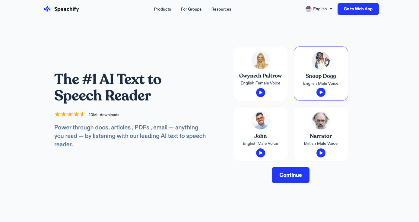
Speechify (2021-2023)
I led the growth & monetization team at Speechify (2 designers ,6 engineers) and was able to successfully increase subscription payments by more than 50% over the span of a year.
radialiq.com (2024)
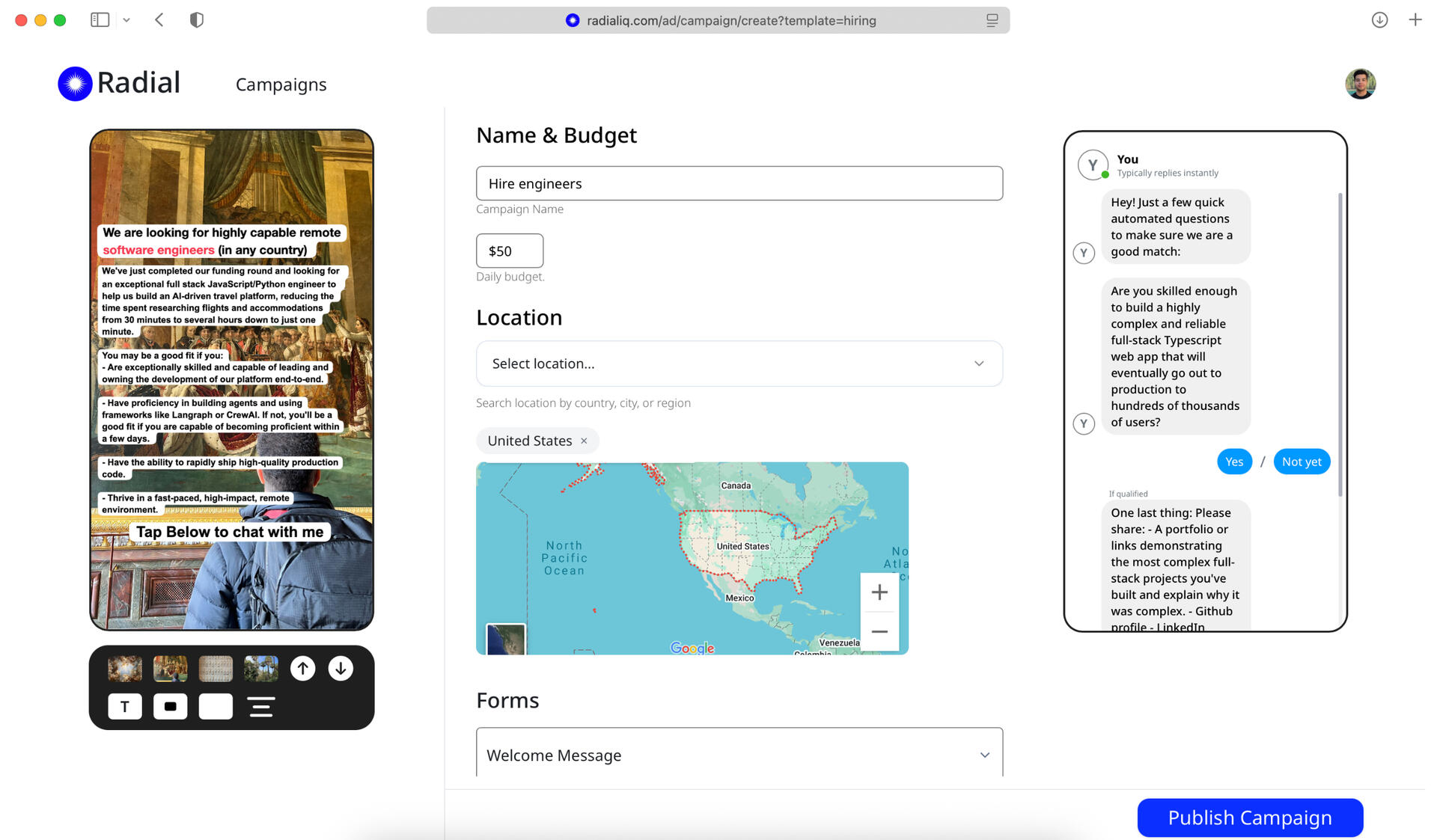
Raised VC funding to build a platform which automates performance marketing
Machine Learning Model: Infer Ethnicity (2024)
This project includes a pre-trained Machine Learning model I built from scratch that infers your ethnicity, similar to AncestryDNA or 23AndMe. I analyzed about 3,000 DNA samples from around the world and about 500,000 alleles from those genomes.
Benk Academy (2024)
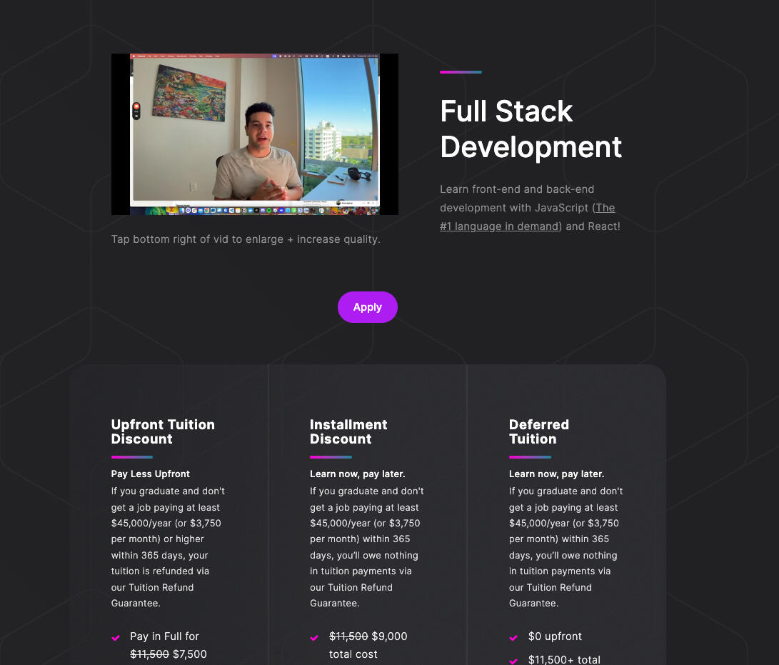
As part of my learning on how to run & scale programmatic ads, I built and taught a coding bootcamp that teaches aspiring software engineers how to do full-stack web development. Stack: PostgreSQL, Express, ReactJS, Node. Was able to retain a 10x return on ad spend.
WOW (2023)
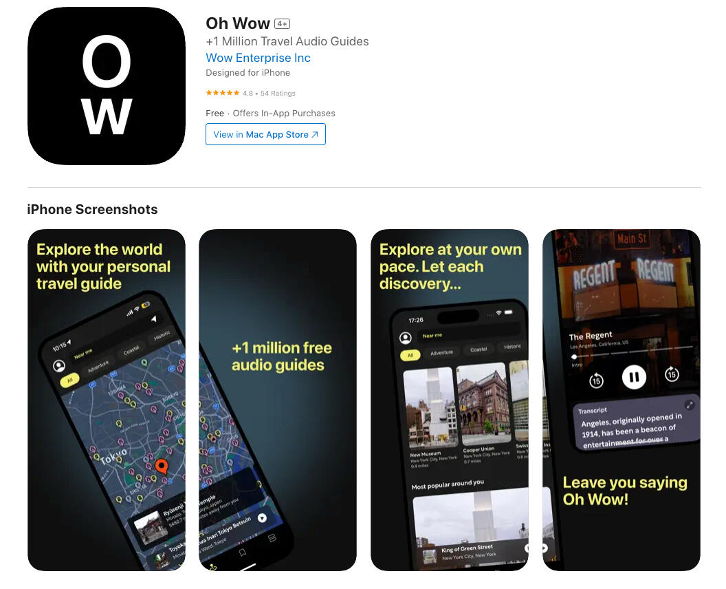
Managed the entire development cycle from inception to launch for a client. Led a team team of 5 engineers and 1 designer.
Adjuster Genie (2023)
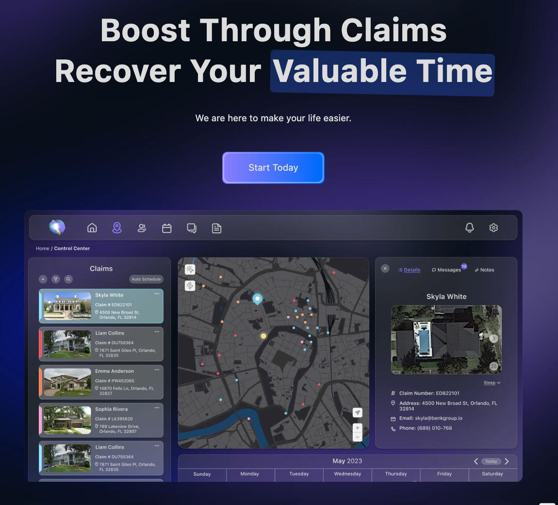
Managed the entire development cycle from inception to launch for a client. Led a team team of 5 engineers and 1 designer.
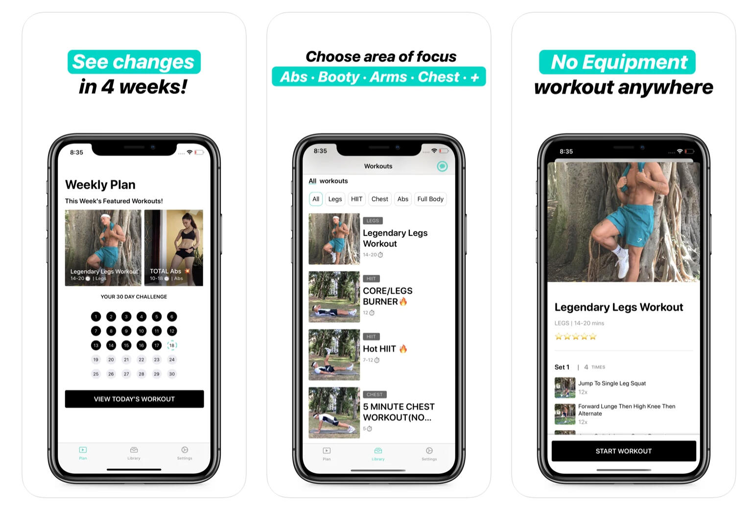
Trene Workouts ( 2020 )
Get access to workouts led by top personal trainers.
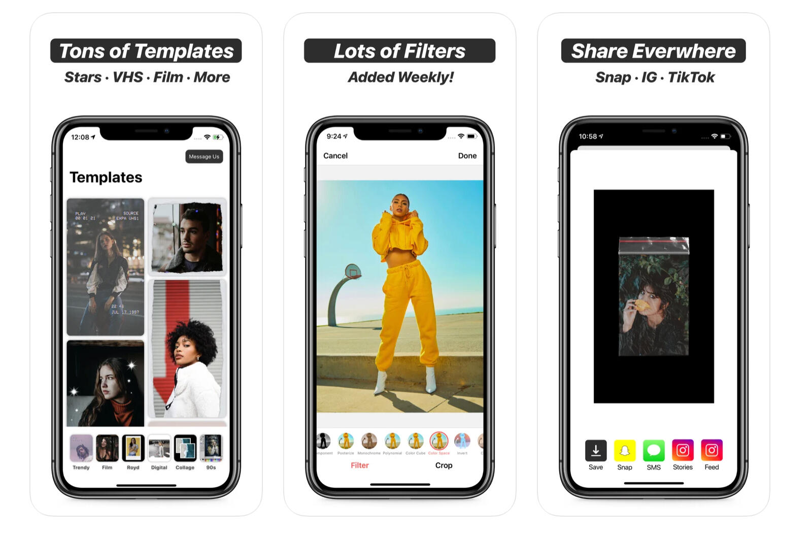
Templates ( 2020 )
Create Stunning Instagram Stories.
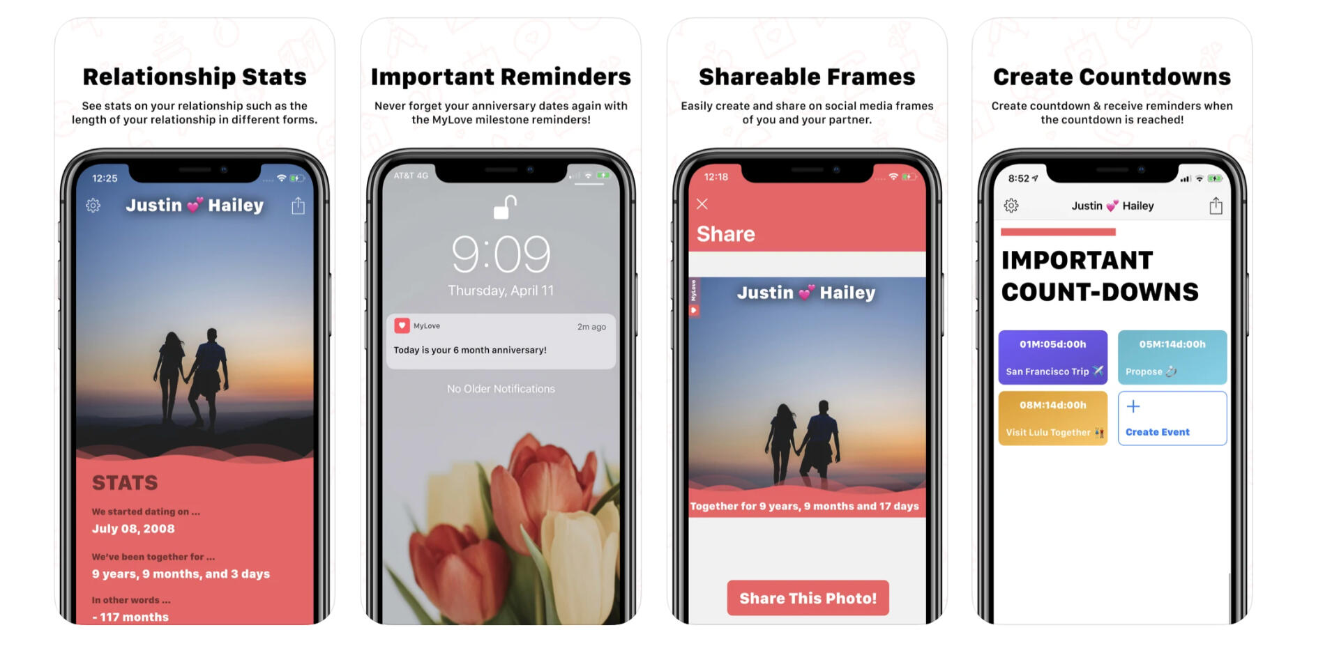
Loven ( 2019 )
Relationship Tracker
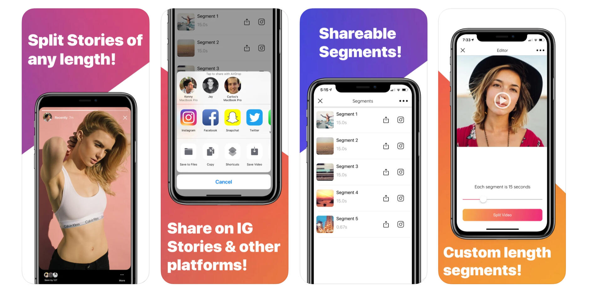
Split Stories ( 2019 )
Instagram Stories Video Splitter
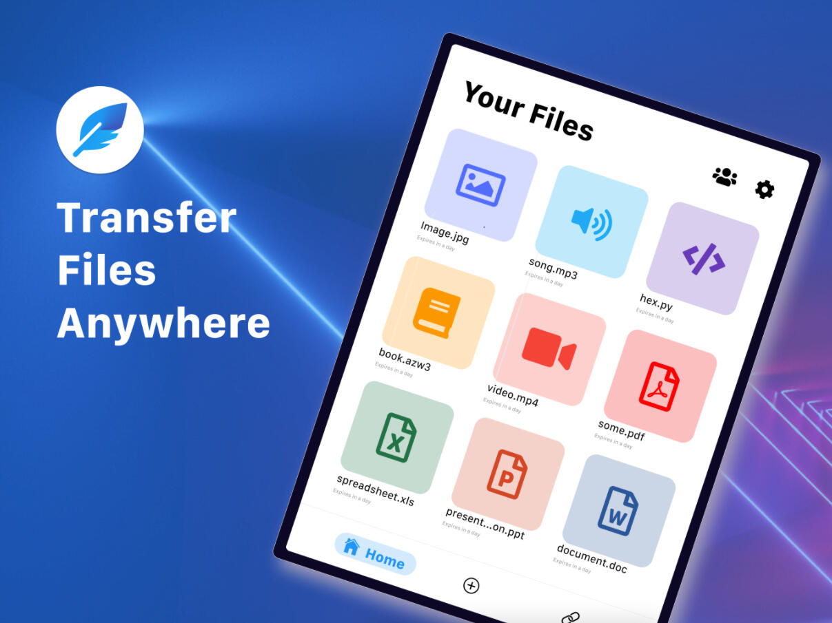
Feather ( 2019 )
Share Files Between Cross Platforms
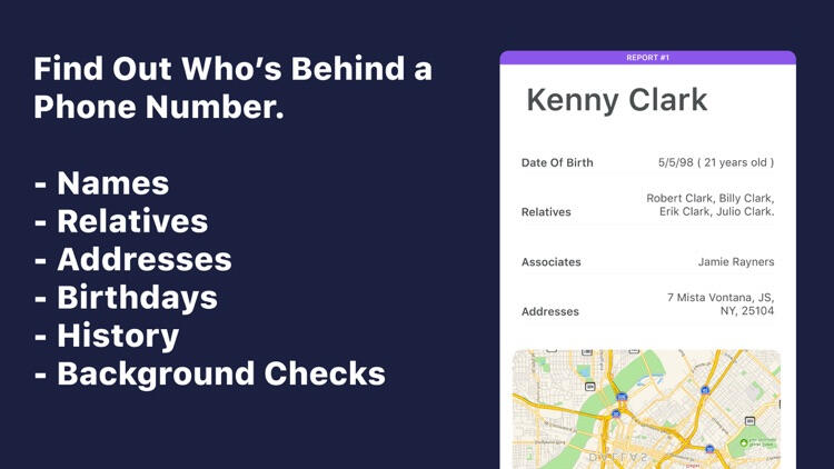
Number Finder ( 2019 )
We discontinued this service.
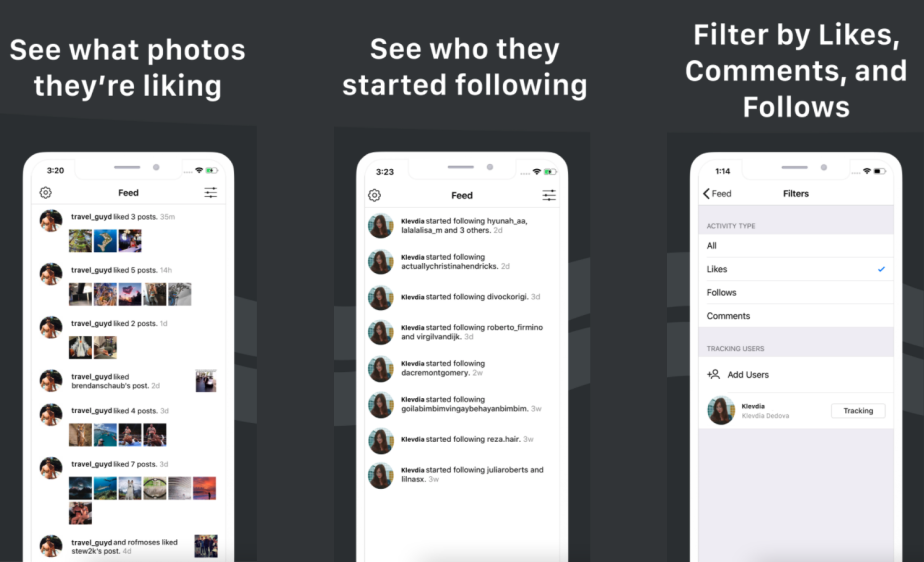
InstaSnoop ( 2019 )
We discontinued this service.
Mundo Shampoo ( 2019 )
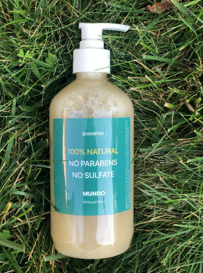
Personal side project/experiement: After having trouble finding an all organic & toxins free shampoo for curly hair, I reached out to a cosmetics scientist on Etsy to make me a custom one and sell it to me in bulk; Which I then packaged up into my own brand called Mundo and sold 20 of them through Instagram ads. I discontinued this project due to low margins.
Vlog Social Network.
Mubimoji ( 2016 )
"Moving Emojis"
Findr ( 2016 )
Find out what the internet knows about you.
Vlogger
Vlogger
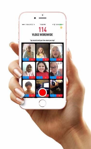
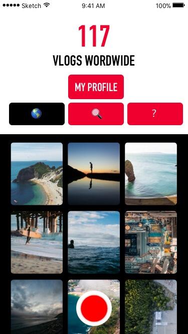
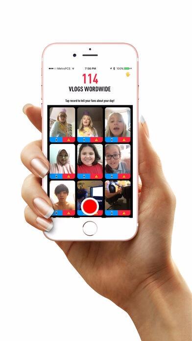
Vlogger is a mobile video app that enables the user to easily share content with the world. The app has been wildly successul and has amassed over 80,000 downloads worldwide.
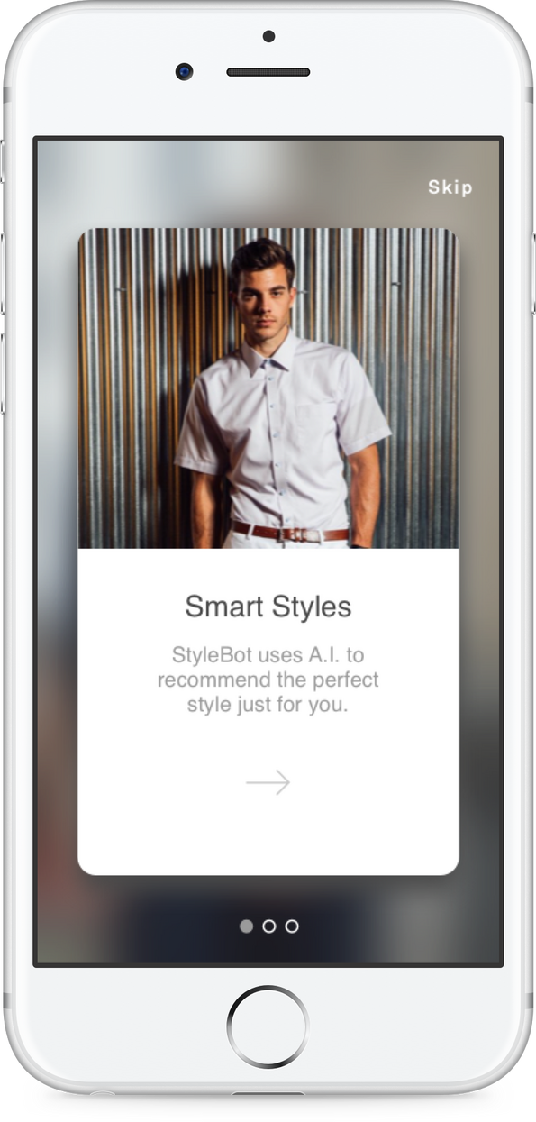
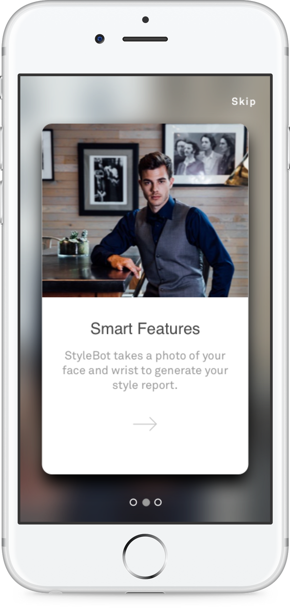
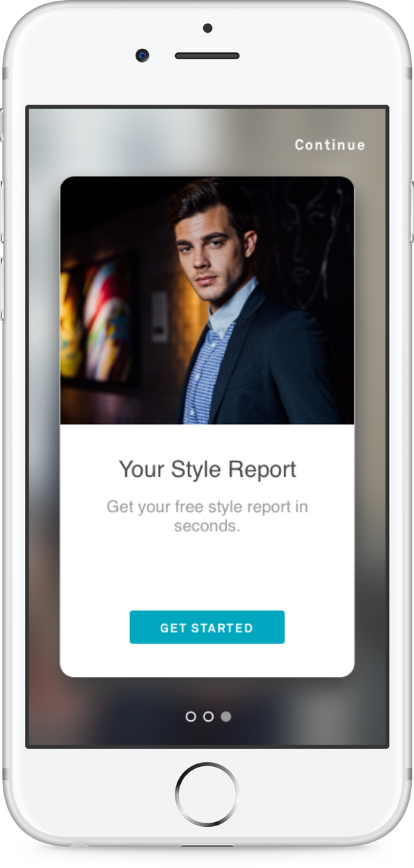
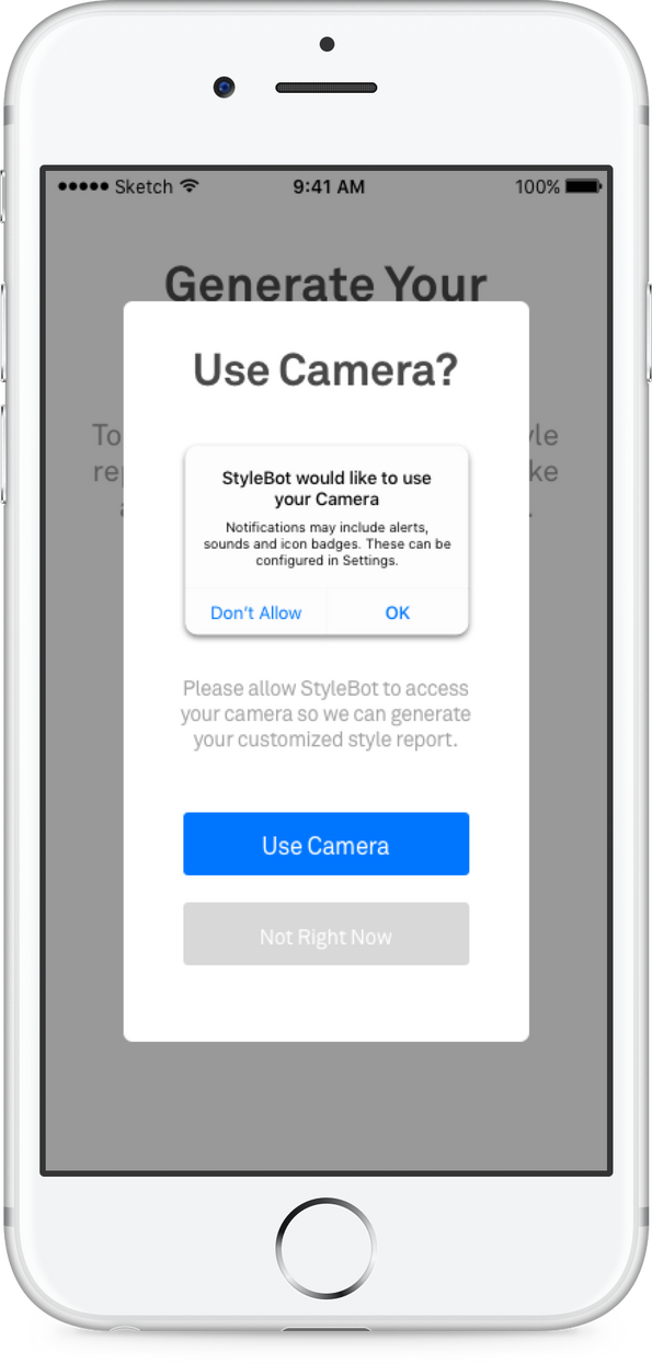
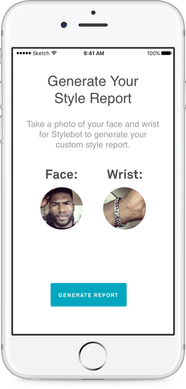
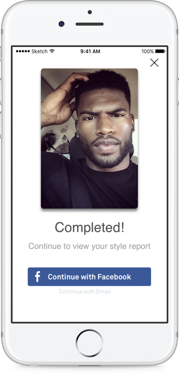
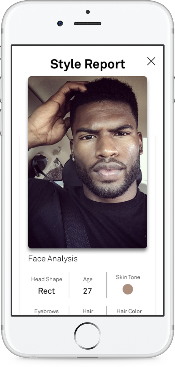
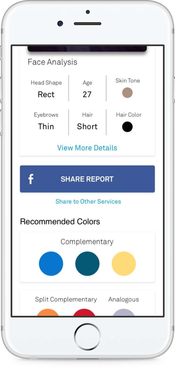
Stylebot
Objective
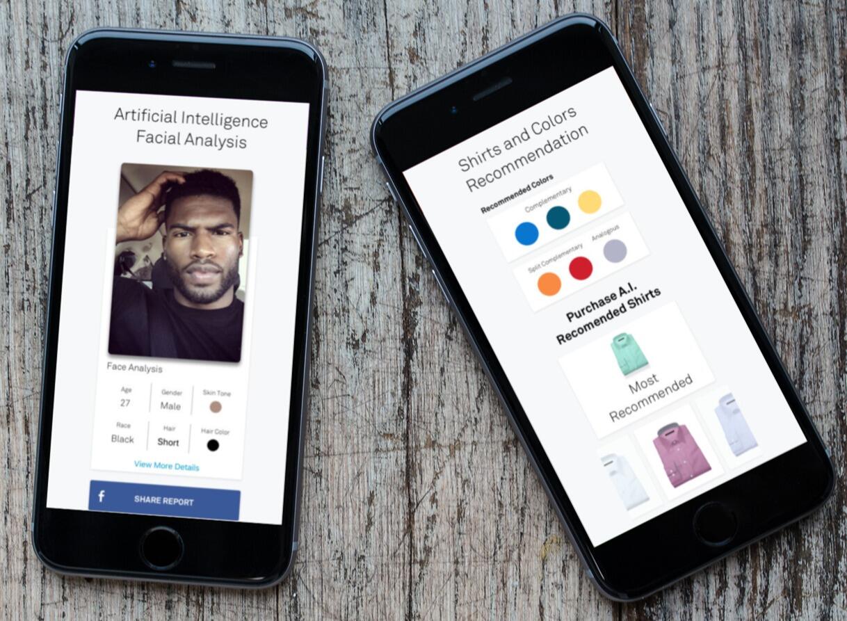
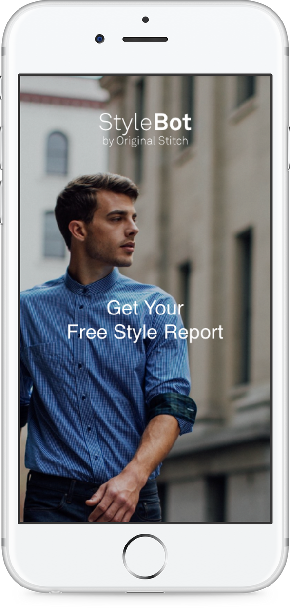
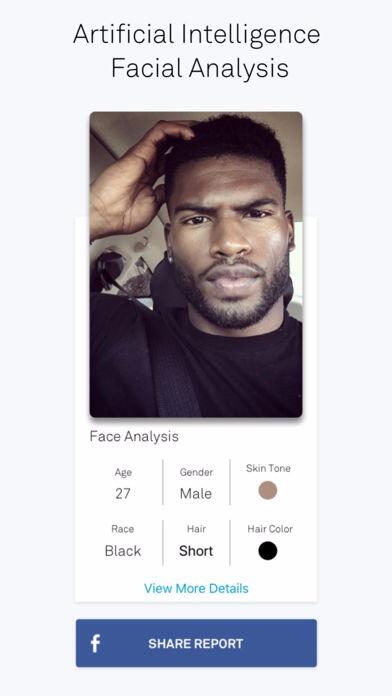
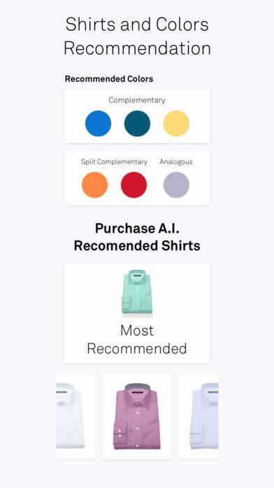
Original Stitch's Stylebot app was aimed to target different audiences and introduce them to our brand in order to increase user growth. We took the project through the entire cycle and shipped to the AppStore.Background
While we were in the hyper-growth stage I was tasked to design an app that would acquire more target market.Role
Similarly to our previous project roles, I took charge and led the research & design, as well as the mobile app development. I worked with two other team members, Bryant (Product Manager), and Albert(Product Designer). We all contributed to the research process together, I worked alongside Bryant to set metrics, and Albert to finalize the designs I had created through Sketch.
Findr - A Case Study
Introduction
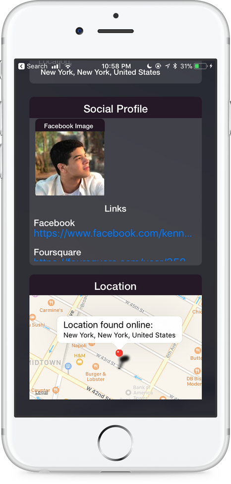
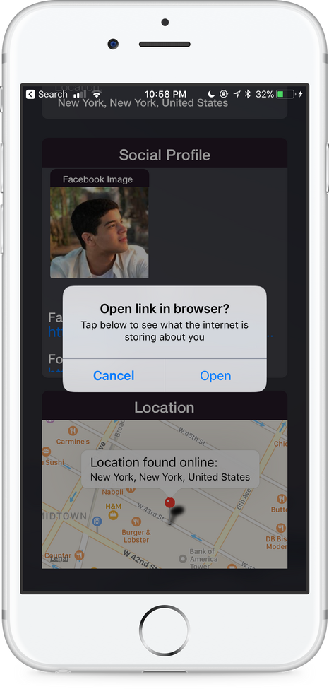
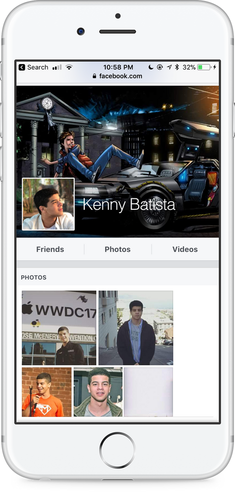
The Findr Project is aimed to reduce the time it takes to research people online by developing an application that aggregates data from multiple sources all at once within a single action. The project was taken through the entire Product Development cycle and launched to the world, where it went viral and currently makes $4,000 a month from subscriptions.Now let’s talk about how it got there.Background
As a Product Designer, one of my high-level main goals is to deeply understand what I’m working with. I use this same approach during my typical day to day life, I found myself constantly researching people I was interested in learning about and potentially connecting with - I wanted to understand folks and build rapport before meetings in order to ensure I had higher chances of having meaningful conversations. But the problem I encountered was that I was frequently hindered by the lengthy process of having to go to multiple different sources every single time.My intuition told me “it would be awesome if I had an app that automated this lengthy ~ 10-minute process and aggregated the most valuable data all at once to view in under ~2 minutes”. Intuitively a mobile app was the best way to go since it also enabled me to take the product on the go and potentially use it at networking events as well.My role
Although I led the team of 3, we all contributed throughout the research process until we agreed on the same possible solution idea. During the research phase I took charge of the high fidelity designs for the mobile application and created it with Sketch ( with the help of a friend - Jay) to finalize it, I as well as quickly developed the mobile app with Apple’s Swift language. My other team member, Alex Peña took charge of developing the product website.Approach
We knew the experience we wanted to build, the next step was to validate and redefine some of our ideas. We conducted user research ( User Interviews & Ecosystem Analysis ) on YCombinator’s Product College students who were in a similar situation in terms of the root problem. We used the data gathered to document and analyze pain points, ideate better on our potential current solution / generate external solutions, and to find business opportunities. This research helped us categorize common themes into our Ecosystem Analysis and validate assumptions we had that would help us better secure our solution.
Research
Initial Survey
To better understand our target users, we sent out a survey to participants which consisted of a few questions about their past people research experience. For example, we asked about how they felt towards online people researching, as well as how they approached people researching - we wanted to start understanding where they seek resources. The survey results were collected from novice to experts in Google-Fu. There were a total of 47 people who answered our survey.By collecting and analyzing the results, we came across a few interesting points that reflect on and validate the lengthy research & missing data issue:
- When people researching, some people feel like they need to understand the whole picture ( context of a person ), or at least as much as they can as possible. Since time is something they value very much.
- Some people felt frustrated when they came across ‘off-grid’ people that couldn’t be found online.
- Unrelated but important to know: some people believed that researching others was creepy and that should not be done.Task Analysis
To actually understand how people go through the people researching process, and better inform our product thinking, we ran tasks analysis on a group of participants. The main purpose of the tasks was to analyze with our own eyes what was happening during the process to better understand their behaviors, as well as receive feedback. Furthermore, I wanted to analyze the one metric that would suffice value proposition if solved with our solution - how long it takes the person to go through the process. We tasked the participants to go on their computers and to find if X person had any pets. At the end of the tasks, we asked several follow-up questions about their overall experience and potential process improvements. While the participants were running through their intuitive people research process we watched closely, took notes - we became the journalists of the domain we were studying. If they had any questions or concerns regarding certain steps, we asked them to express them anytime they felt comfortable. We also asked participants to think out-loud while they went through each step.Some of the discoveries from the task analysis were very intriguing and informative. What we discovered was:
- Most had over a dozen tabs open with Google searches.
- Some participants were hindered and didn’t know where to start looking for the data.
- Most participants took longer than 5 minutes to complete the task.
- Some were surprised by how much data about people is online. This discovery touches on the previous encounter as well, some people feel taboo/surprised about researching others. This is a type of audience situation.After the research, it became clearer to us that we needed to focus on optimizing the process speed for the product, but to also keep in mind:
- We must advertise this product in a very ethical manner since we’re solving in a sensitive area where the product might be used for wrong doings.
- Multiple tabs has the adverse effect of slowing down the user, as well as creating a messy/unorganized work environment. Fixing this will help us with the optimization.
- In our possible solution, we need to fulfill the needs of the type of audiences who were novice researchers and didn’t know where to start looking.Ecosystem Analysis
We now take all of user interviews research done previously to inform our product thinking while we organize the information into a contextual ecosystem format that will help us with the solving phase. Let’s let the 5Ws1H lead the way.(Why) are we focusing on this problem?it’s very important to be grounded. To remind ourselves, we now quickly revisit why we’re focusing on this problem, the impact we’re doing, and how it can financially benefit the company.🛠 Problem Observed:
The methods used to research people online have remained unchanged for over a decade. They usually consist of a researcher opening up Google and typing in the name of a person on different social networks. This method’s adverse effect is that it proves to be slow & hinders success when speed is crucial.😃 People Benefits:
Its redesign is an opportunity to improve how fast the user solves their problem. And this is what our value prop is.💰 Business Opportunities:
If proven successful, our product could potentially have business opportunities, such as us providing a subscription business model where we could charge users a monthly fee. All we need is 10,000 users to pay us $9/m for over a year in order to have our first $1,000,000.(Who) are the users of our product?Although we already chose the audience we are building for based on the context of the problem, we thought it would be fun to brainstorm on different audiences and how their specific needs differ based on motivations.Choose an audience & Describe them:
1. ( our audience ) 👨💻People simply curious about the background of a different person might do a single search as usual. Our product must have a redesigned people research algorithm with the need of speed in order to provide this audience a value proposition.
2. 🏢 Companies interested in researching their users might have tenths of thousands of users which would mean they would probably want to mass research.
3. 🕵️♂️ Private Investigators would most likely want to keep a super low profile while searching.
4. 👫 People with a prospective date might want to check the if the person has a criminal history.These audiences have similar motivations, but slighter different needs. I will focus on the first audience since it was the root context of my problem. Then eventually suffice the larger needs of other audiences.(When/Where is this product being used?, User Needs)When we think of the user context in relation to using the product these are the things that come to mind.
- At networking events - The user would most likely need as much information as soon as possible to make sure they’re prioritizing networking.
- During job search - learn about recruiters & employees in order to understand how to build rapport before an interview.The audience needs while using our are to ...
- Search data from multiple sources at once - make sure it suffices the speed proposition.
- See the data in an organized format. - Powering usability by making it easier for the user to scan the data.
- Leave no trace of the search. - In order to not come off as creepy or cause any marplot.They feel ...
- Excited to have found a lot of data.
- Unfulfilled/Anxious if there’s not enough data to suffice what they were certainly looking for.
- Angry to have not found any data at all.Being cognizant of what the user feels during certain edge cases is crucial, it would enable us to see different approaches to making sure we provide features that leaves the users feeling fulfilled before leaving the app.
Solve
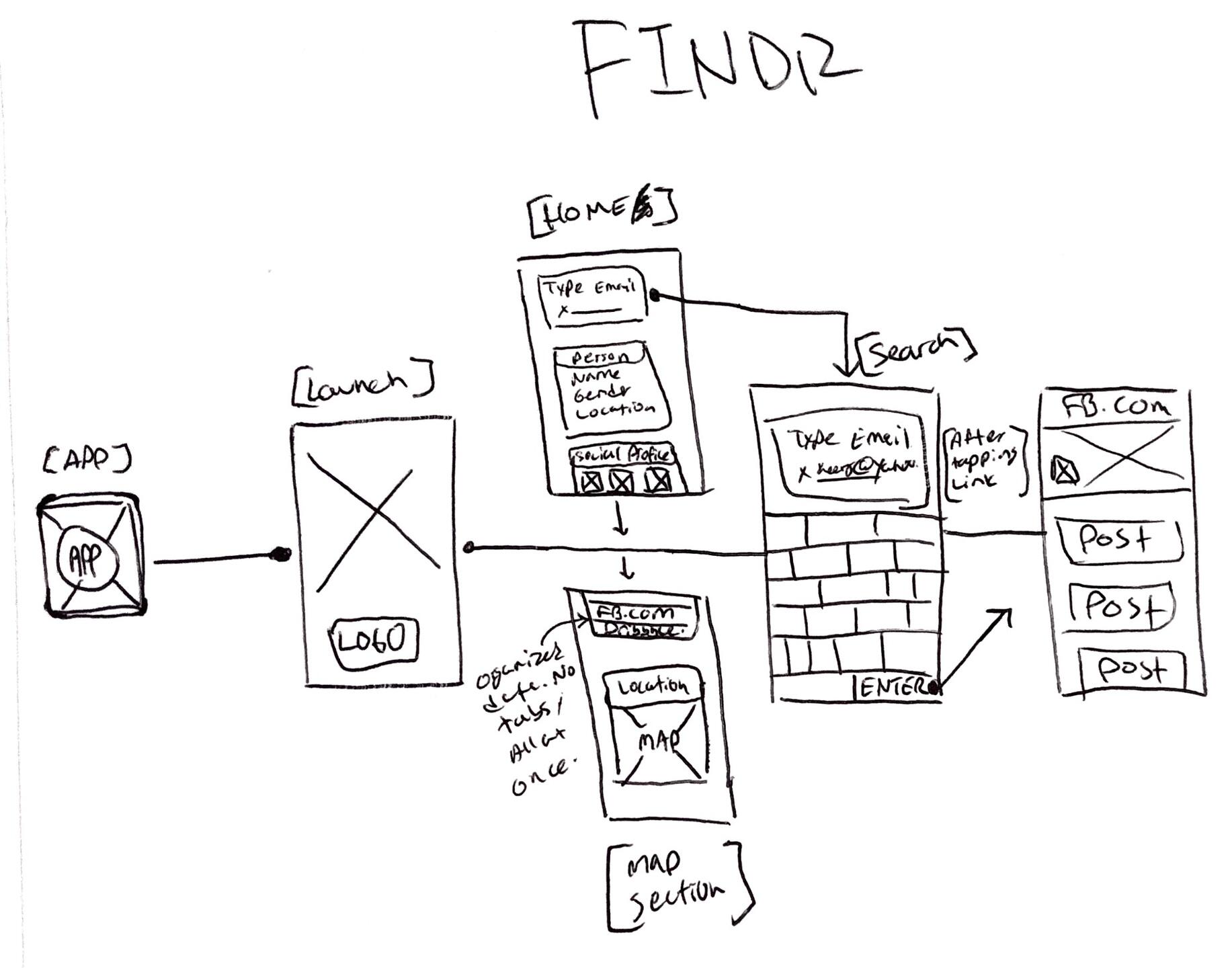
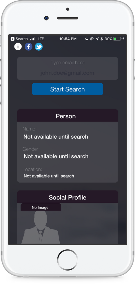
We now use the contextual data to guide us while we ideate and develop our wireframes & designs.
Sketches
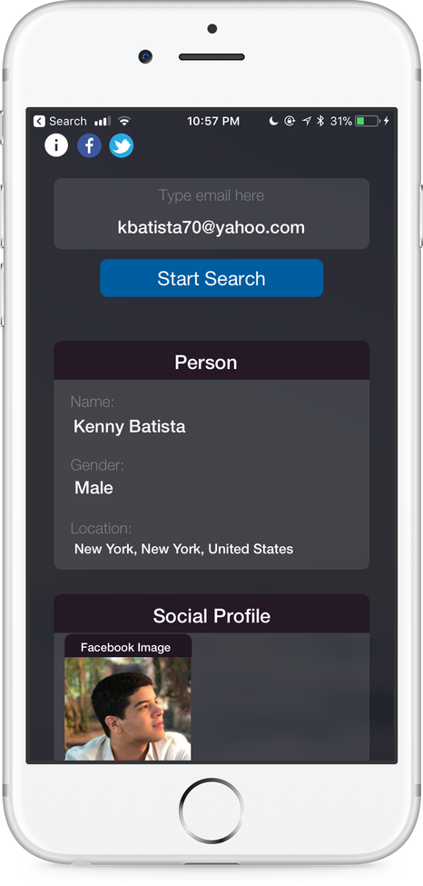
Designs
(How) can we measure success?If these metrics are met, we will consider our product successful:
- 💰 Cash Flow (how much money we’re making) - $300 in 1 month
- ⬇️ Downloads (How many people are downloading our app - 1,000 downloads in 1 month
- ✅ Success Rate (How many people find search matches) - 95% success rate
- 💥 App Crashes - If we have almost no crashes.
- 🗣 Feedback - If we receive valuable feedback that informs our next iteration.
Business Model:
- We went ahead and incorporated a map so the user could see where the person they're researching is originally from. This information is pulled from the API we were using. We charged $2.99 for this extra feature.
Launch / Findings / Retrospection
The night before we launched on Product Hunt, we hoped it would go viral. This came from seeing how our friends were using the prototype, although it was a super beta version, we saw a small wave of virality - they would search for people and get really excited on their findings and call their other friends to come search themselves up and see what they would find. I also took charge and used some previous growth experience ( driving traffic from SEO / ASO.We went to sleep. The next morning, we were woken up around 6 AM by tons of phone calls and e-mails from the press that wanted to learn more about the app. Read some of the press articles below:
- https://www.insidehook.com/nation/findr-app-privacy
- https://wwwhatsnew.com/2017/02/03/una-app-que-nos-dice-parte-de-la-informacion-que-internet-sabe-sobre-nosotros/
- http://www.idownloadblog.com/2017/02/04/apps-of-the-week-february-4/The app had gone viral on product hunt, it reached number #1 before staying at #4 for the day.
- https://www.producthunt.com/posts/findr-2Early that day, most customers were angry. I wanted to figure out why they unsatisfied. These are the steps we took to figure out the root cause of the problem and fix it:
- We read the feedback we were getting from angry customers. A lot of it said that the app wasn’t working. That nothing came up when searching.
- We went to test the app out, and it wasn’t working at all 😱.
- After running some network tests, we looked at the developer portal, and it turned out that there’d been a server overload and that the API was rate limited - too many people were using the app at once.
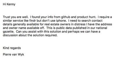
- We fixed it and it started working again.After we waited a couple of hours, good feedback started to come in. Just that this time, there was a different type of audience that weren’t angry customers, but trolls.Findr was an MVP, a very simple app that fixed the problem. When we launched into Product Hunt ( mostly a developer audience ), the developer culture criticized the app saying that they could build something a lot more complex.The next day, something very interesting started to happen. The press articles were being read by non-developers, people in different communities - Companies, Real Estate, Recruiters. They started reaching out with their specific feedback & needs:
We took some time to retrospect. Here’s what our thoughts were:
- By launching the app and having it go viral, we discovered audiences that we hadn’t initially thought about.
- Just because your product does not work for a certain audience, does not mean there isn’t one. That’s why repurposing products/content in different areas is a good technique.
- Looking at our previous set metrics, here’s what we succeeded at and didn’t succeed at:
👍 Cash Flow - First two days, we made $500 through the AppStore. The following weeks, we sold internal subscriptions to companies.
👍 Downloads - We received 3,000 downloads on the first day. The goal was 1,000 in 1 month.
👎Success Rate - 75% success rate. The goal was 95%.
👎App Crashes - Lots of crashes in the app, buggy as well.
👍 Feedback - We received lots of good feedback from the public.Although we still consider this MVP successful. The crashes & search success rate failures for some caused a lot of pissed off customers who gave bad reviews.Going through the entire Product Development process and launching it to the public was one of the most rewarding things I’ve ever done. So much learned about design, people, and business.
Original Stitch homepage, a Redesign case study
INTRODUCTION 👋
Objective
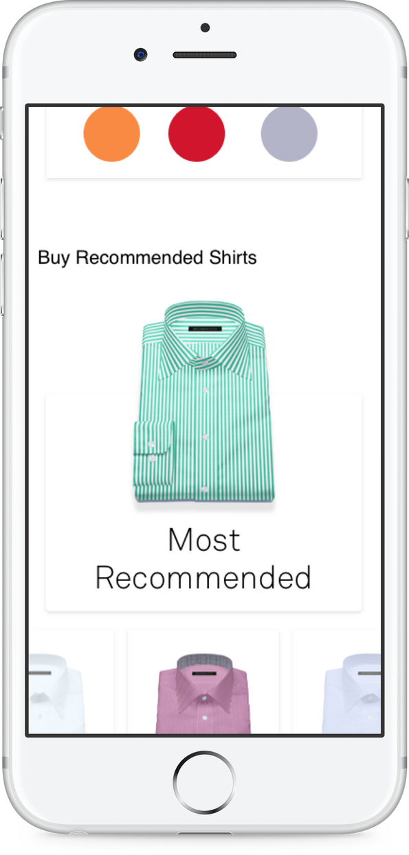
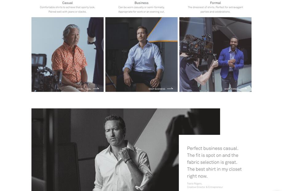
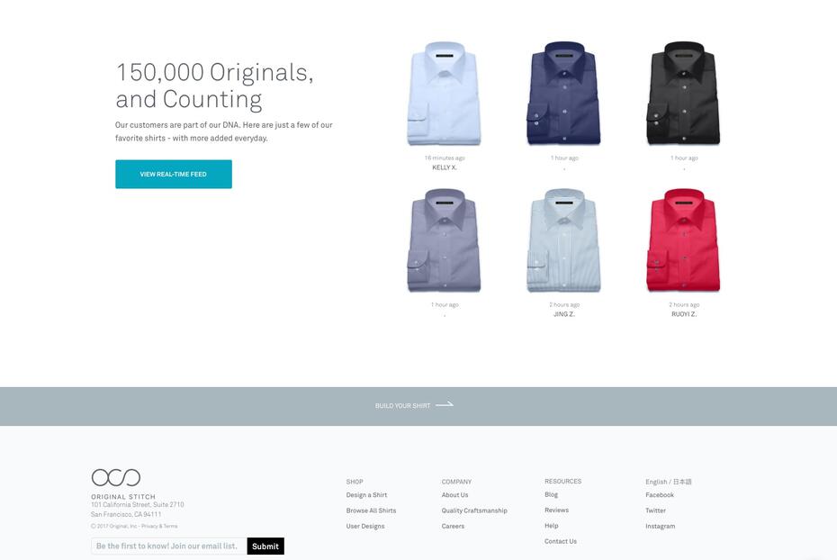
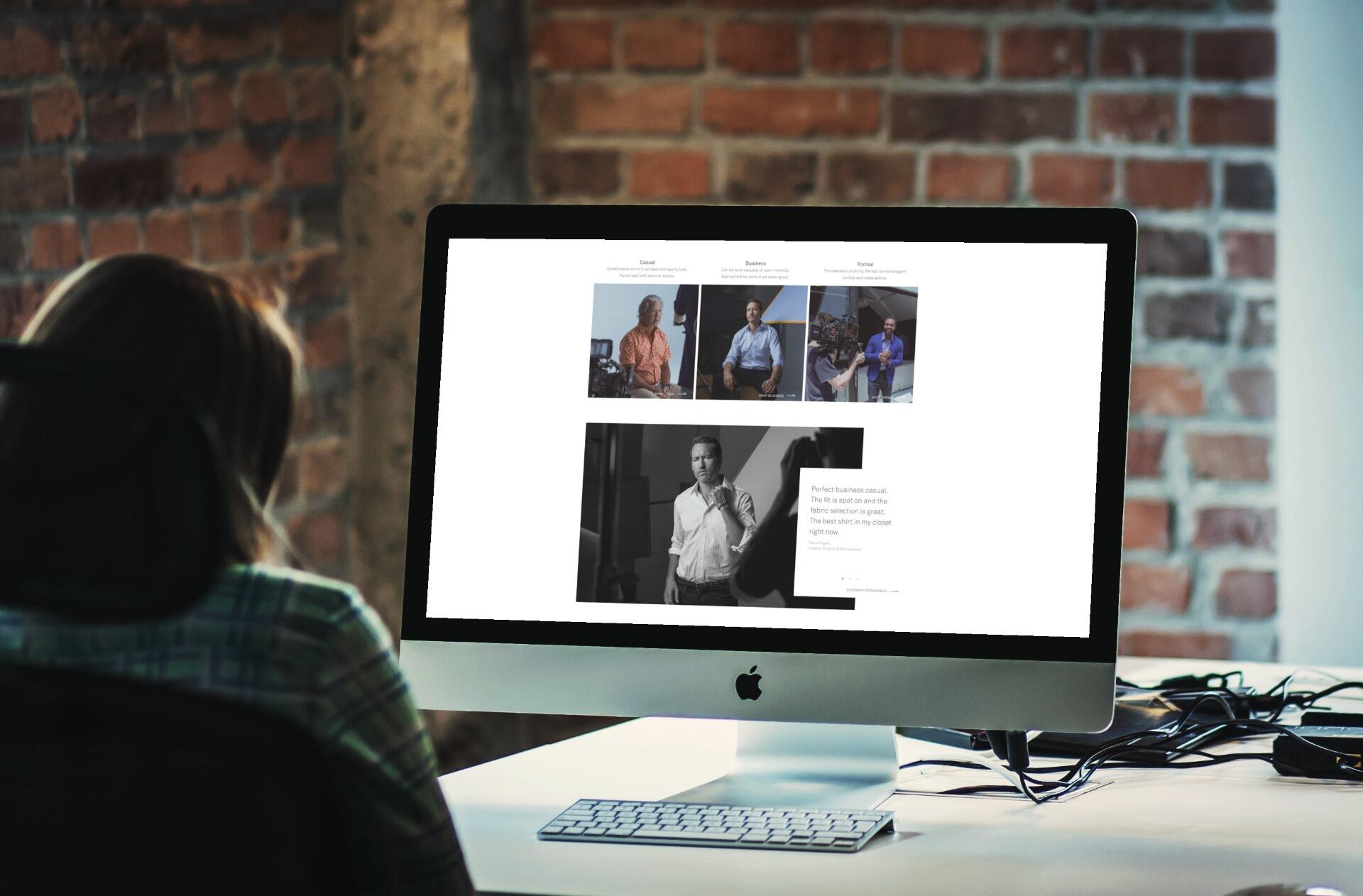
The Original Stitch homepage redesign was aimed to reduce the initial visit bounce rate from visitors and improve customer satisfaction. We took the project through the entire cycle and shipped it to the world where we saw reactions.Let's talk about what it took to successfully redesign the homepage.Background
I was originally a customer of the product, after seeing a mismatch between the quality of the shirts and the negative digital experience I had to go through to get it, I decided to take charge. I reached out to the founder through a mutual connection, who then brought me on to solve the problem.Role
Although I took charge and led the research/design/development, I worked with two other team members, Bryant (Product Manager), and Albert(Product Designer). We all contributed to the research process together, I worked alongside Bryant to set metrics, and Albert to finalize the designs I had created through Sketch.
RESEARCH 🕵️♂️
Heuristic Analysis
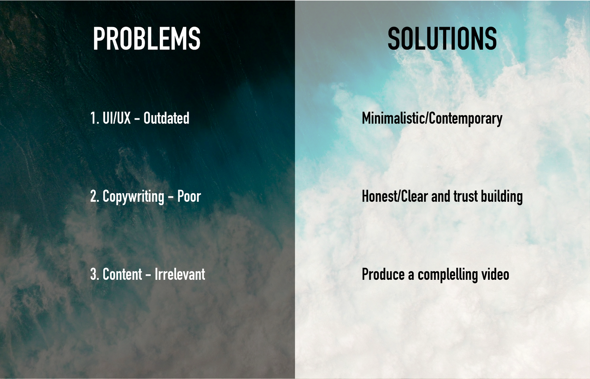
After critiquing the before version of the Original Stitch homepage, I came to the analysis conclusions:Irrelevant content, poor copywriting, outdated UI styles conducted bad shopping experiences. Unenjoyable.- 1) Copywriting - Poor short, advertorial, and outlandish copywriting throughout the site. Customers can notice the sales-sy overused tone through the site.
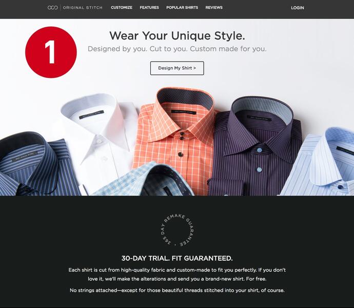
- 2) Content - Irrelevant, the user cares about the product that they’ll get in the mail. Not the unattractive process done in factories.
- 3) UI/UX - Outdated styles give off a low-end website that does not match the high-end product they’ll get in mail.
User Reviews Analysis
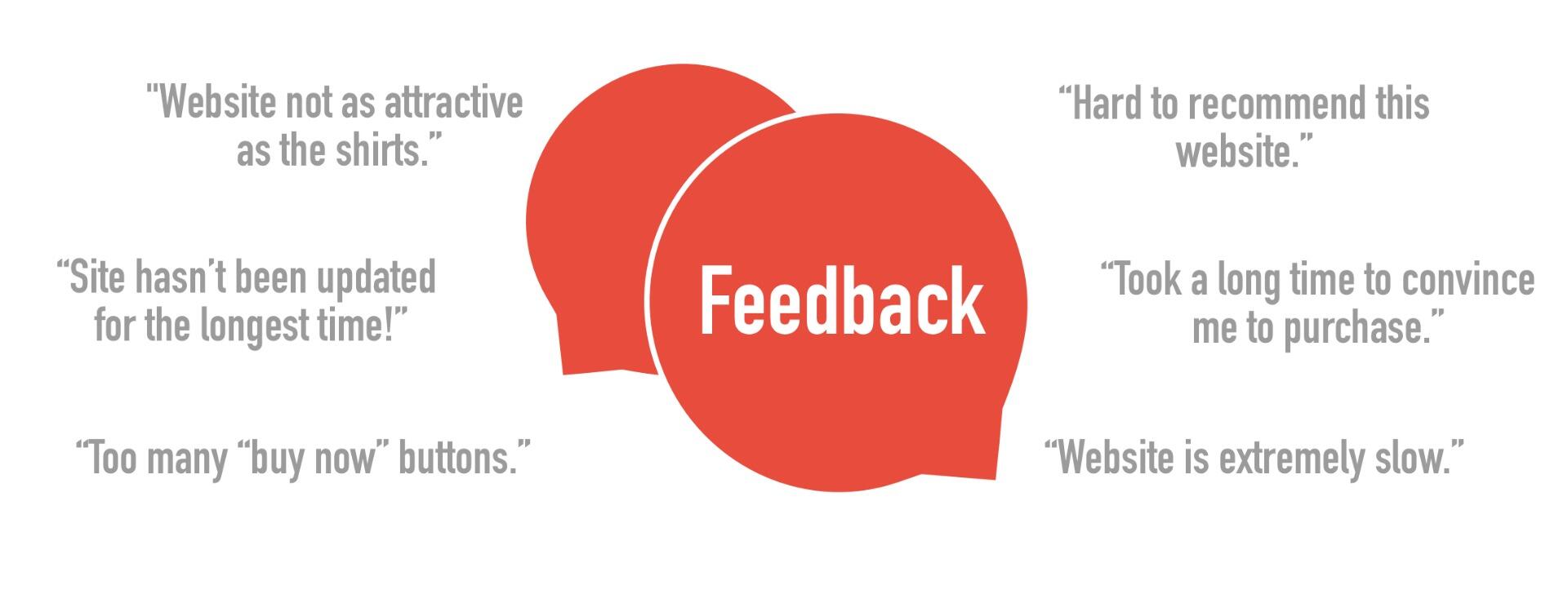
We conducted an in-depth analysis of the reviews left by the customers. We wanted to be data-driven in order to validate previous assumptions made and really understand and listen to their needs or pains.Once we were done analyzing, we prioritized and clustered the most common reviews with our finding from our heuristic analysis and used it to inform our product thinking when creating the solution.
Problems & Solutions
SOLVE 🛠
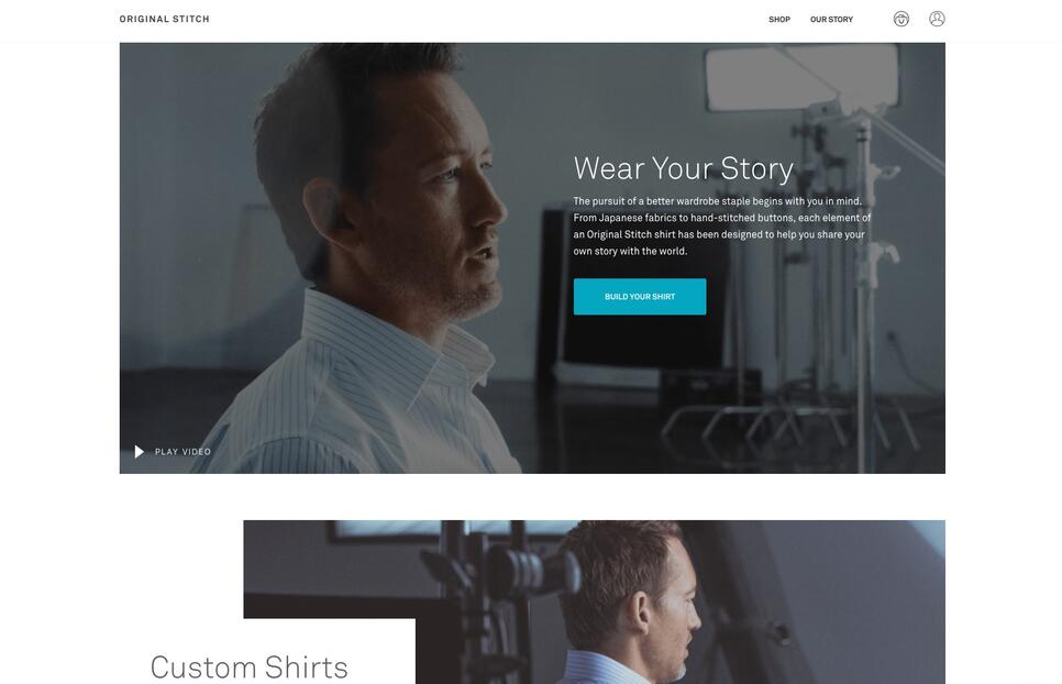
UI Designs
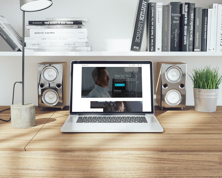
Storytelling Through Video
Storytelling was a big part of the redesign as well - which when done effectively raises the bar when converting visitors into customers. I love the process of persuasion!As video is currently trending, we used it as a form to tell our story through our customers. I worked alongside a video producer to sell our brand through storytelling.It was a lengthy, but worthwhile and fun process where we brought in customers to our HQ for interviews and story crafting. And then came up with the story of who the Original Stitch man is video. An elegant form of using storytelling to sell our product.Some of the questions we answered were:What’s the vision that they have of being/becoming?
The Original Man creates their mark by designing and building their own shirt - CEO’s, Founders, and Leaders.What quality should they expect from our products?
Made-to-fit, hand-made shirts built with care. The highest quality laser cut fabric there is.Why us?
We show we’re better than others by transparently telling our story from a customer’s perspective and tying in the who and the what in order to convince visitors with why they should buy from us.
OUTCOMES ✅
Success Metrics
- 👍 Bounce Rate - if we reduced visitors bounce rate by 20% m/m
- 👍 User Growth - if we had a 20% user growth m/m
- 👍 Sales Growth - if we had 20% sales growth m/mI had so much working with my team on this project. Blew my mind how great design can eliminate bottlenecks within business. The redesign went a long way and succeeded in every success metrics we had set. But that doesn’t mean we’re done, good design is relevant!
Looking for something more in-depth? Check out my other case study which dives in much deeper into my process.
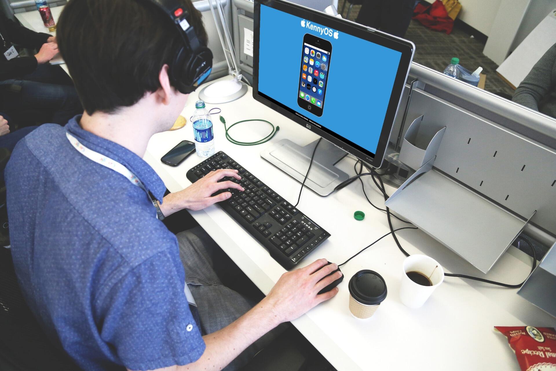
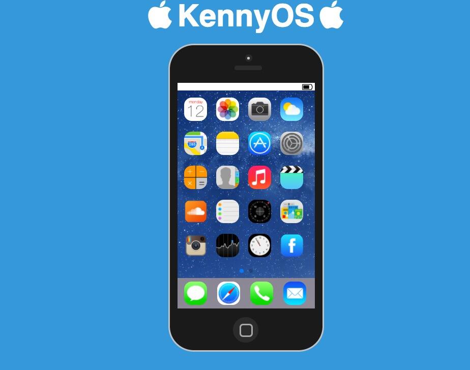
iphone emulator
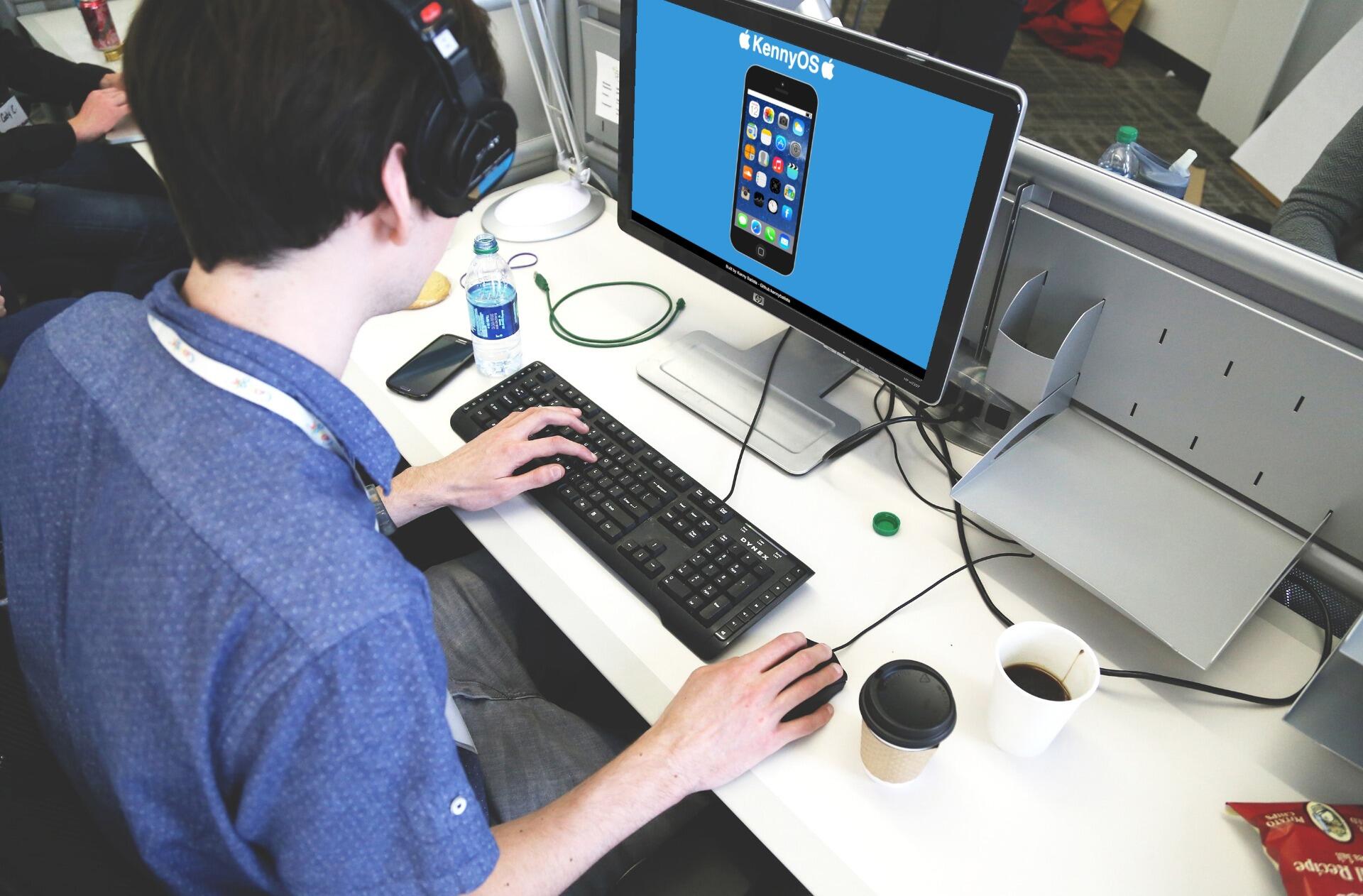
Background:
This project was a personal challenge to teach myself Front-End web development by creating an iOS interactive emulator on the web. I successfully learned HTML/CSS/JavaScript and shipped the website live.
Evernote Keep
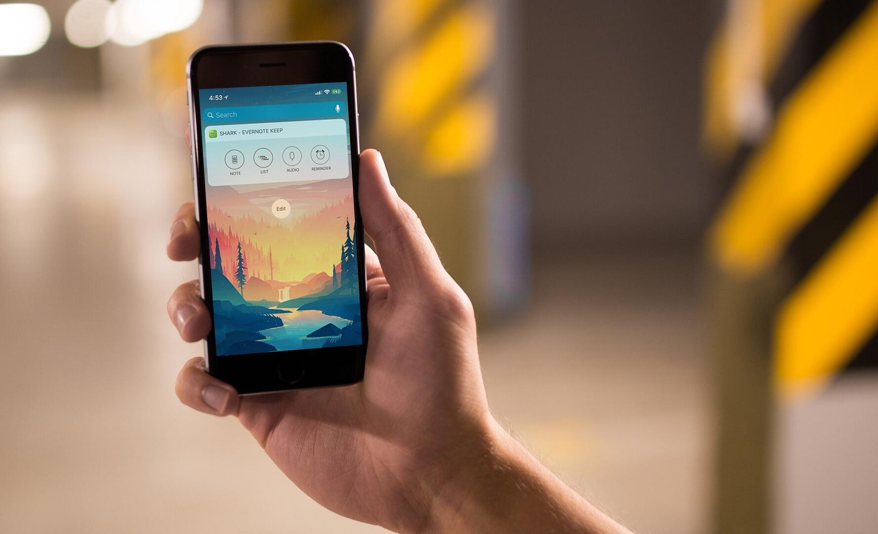
Background
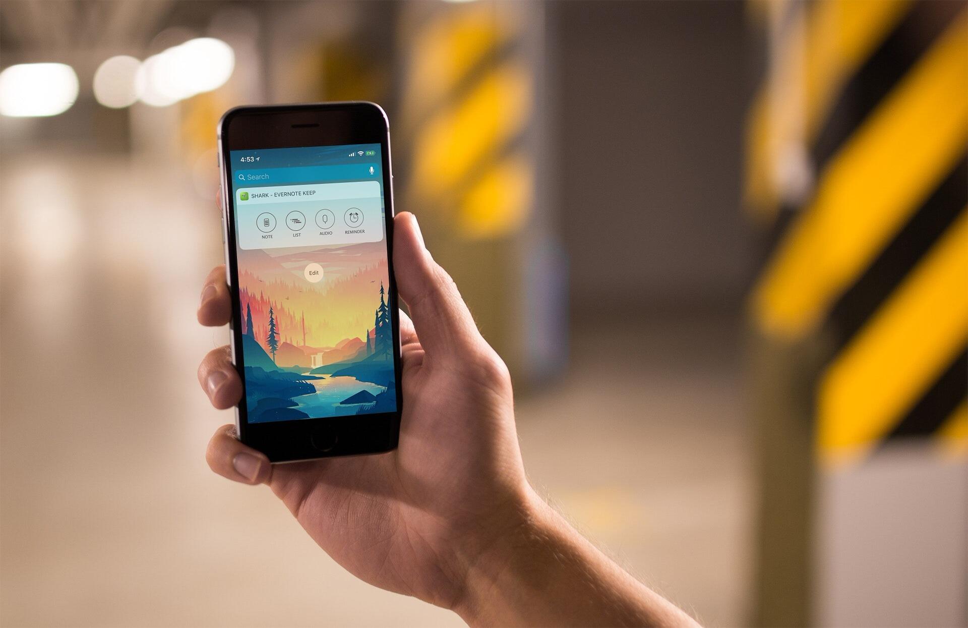
The Evernote Keep app is aimed to serve as an extension to Evernote that allows the user to quicky jot down thoughts on the go right from the lock screen without having to go through the painful process of unlocking the phone, tapping on the app, and creating a new note. Evernote Keep does all of it in one tap.Role
This was a personal side project of mine to fulfuill a need. I designed, coded, and shipped it myself to the AppStore.
Mubimoji
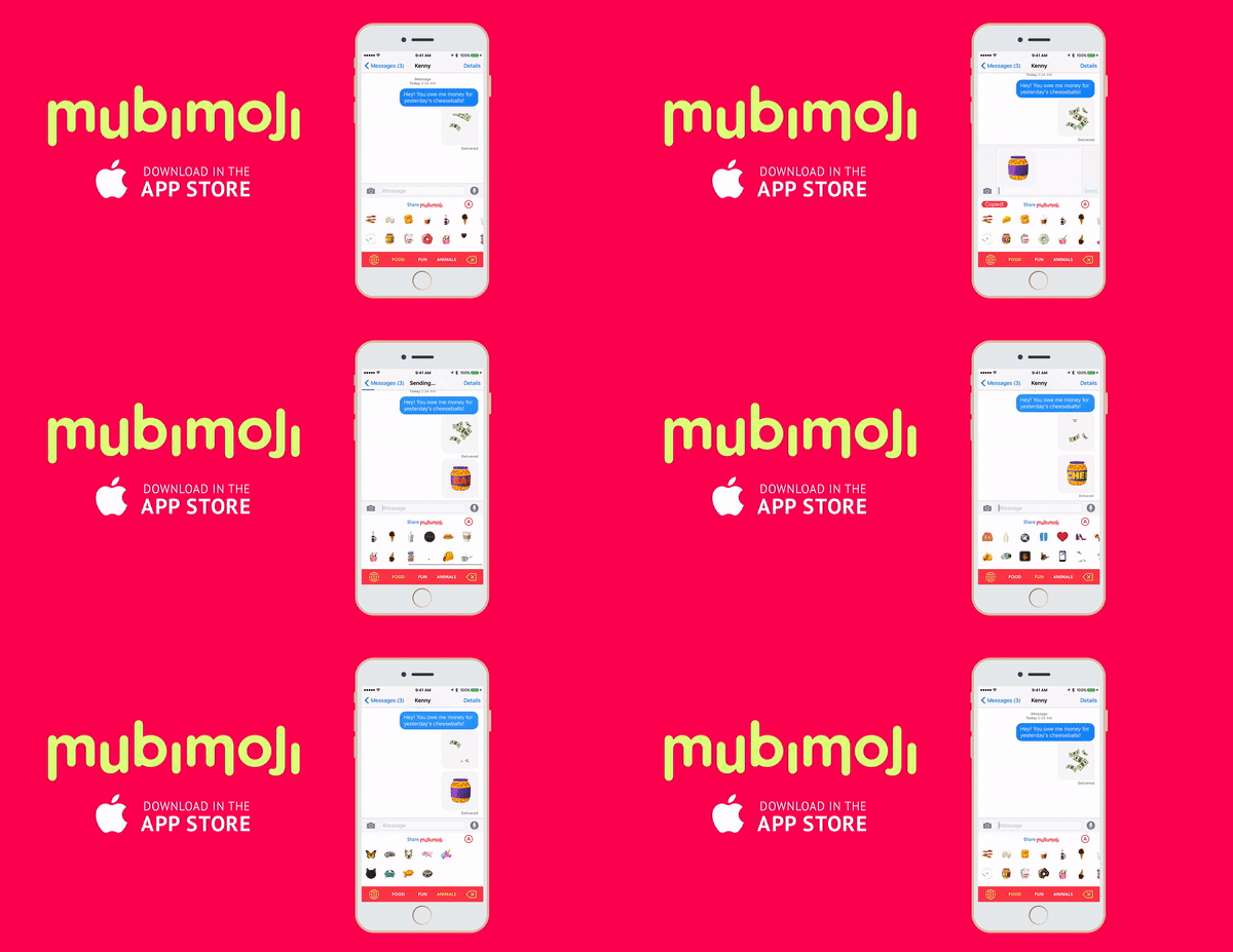
Background
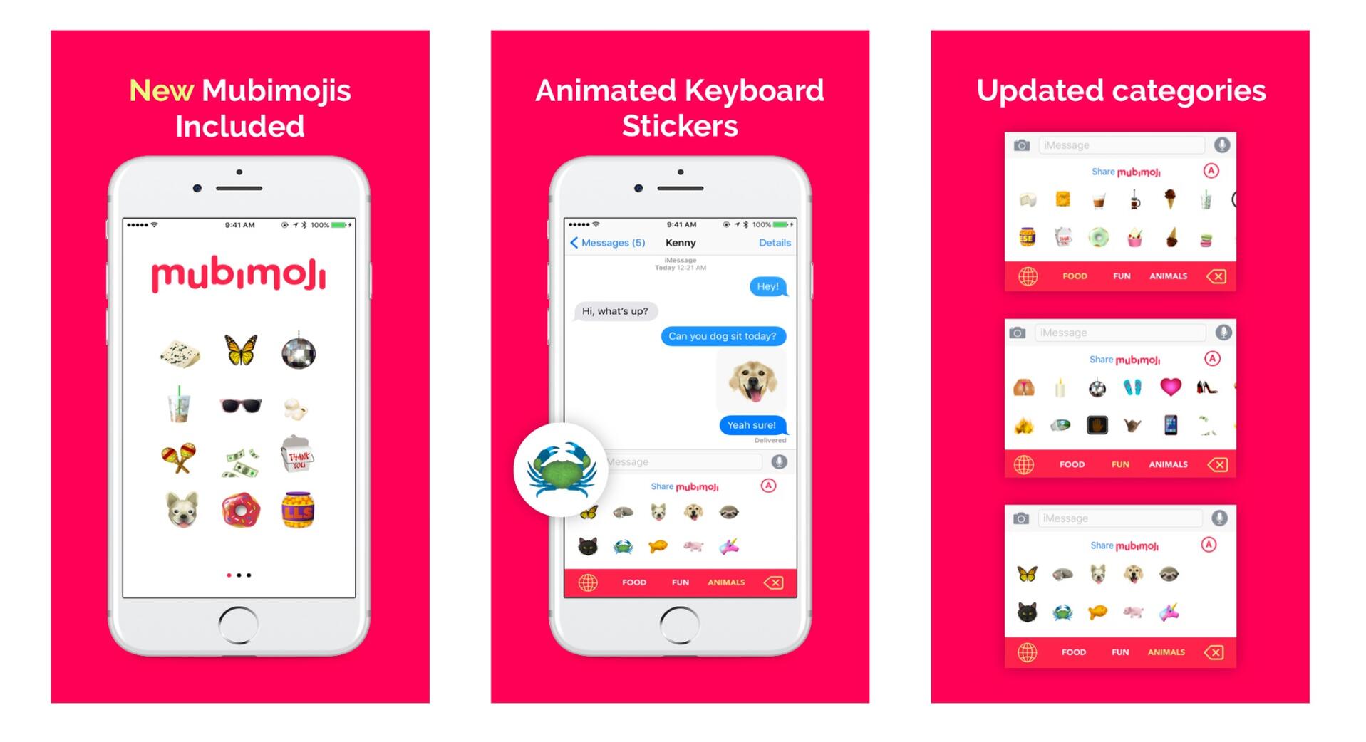
Mubimoji is an animated sticker keyboard for life’s best and worst moments. For that awesome road trip with friends, or days when you eat an entire bucket of cheese balls and forget to do your laundry again.Role
I'm competent in iOS development, as a way to understand and improve how the designer-developer collaboration relationship really works, I teamed up with a designer and worked as a developer to ship this app to the AppStore.
About me
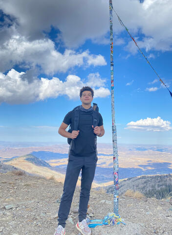
👋 I'm KennyI am a Technical Product Manager with a background in Software Engineering. My goal is to find product-market fit, whether it is on a micro or macro scale. I have a data-driven principles & process approach to problem solving. And as always, a focus on people over pixels.Hobbies: working out, hiking, meditating, and traveling.
Where is Kenny?
"Currently Buying My Freedom"
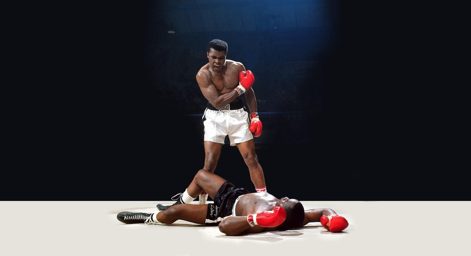
2018, age=20
What have I done so far?
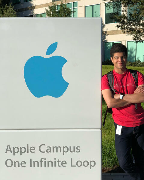
- Worked at Apple as a software engineer & launched products to customers.
- Launched my first commercial products for Original Stich to more than 1M people.
- Studied Philosophy and Psychology. Currently interested in Neuroscience, Poetry, Music.
What do I want to achieve ASAP or by EOY?
1. Financial Freedom.
2. Build an effective team of highly intelligent productive people.
3. Start a startup, build great products by creating meaning and value for people, then sell them.
4. Launch a product in a lucrative space, such as AR/VR || Crypto.
5. Win an Apple Design Award.
6. Become a Thiel fellow, get into YC.
7. Get funded by a big firm like Sequoia Capital.
2017, age=19
What did I do?
- Received a scholarship from Apple.
- Worked my first real job as a SWE at Original Stitch. Developed two products. Launched them following year.
- Traveled Spain w/ Alex.
- Launched personal apps, both went viral.
- Studied Computer Science & Product Development
2016, age=18
What did I do?
- Learned to think for myself.
- Graduated High School.
- Interned at NYCDA. The company got acquired.
- Learned iOS dev, Front-End web dev, Back-End dev, design.
Other Big Dream/Goals- Learn to make beautifully sounding and written music, find a way to get it out there & have it trend on Spotify. Like Yaeji.
- Travel lots. Learn to make life into movies. Like [Sam Kolder](sam kolder instagram) and Jay Alvarrez.
- Get into the film industry, act in movies.
- Get into fashion, learn to design my own clothing line. Don't have to necessarily sell it - but I would like to wear something I created rather than what other people designed. Something that uniquely defines me.
- Buy an entire island w/ some of my best friends.
Thank you! I will contact you within the next 24 hours! In the meantime feel free to connect with me on LinkedIn
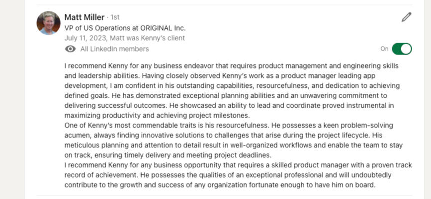
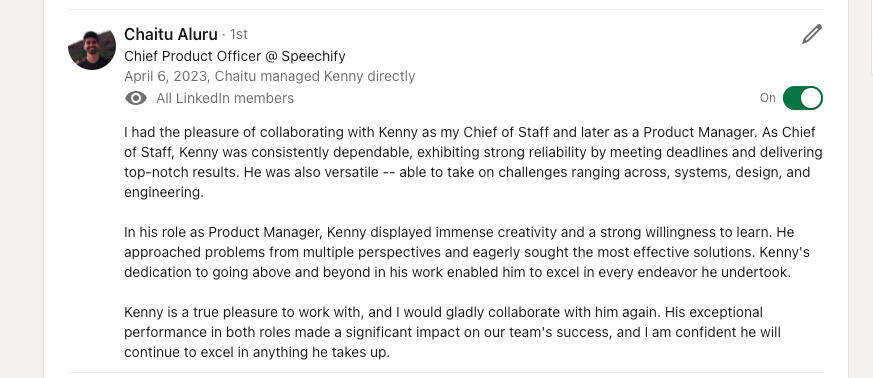
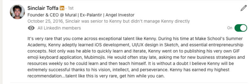
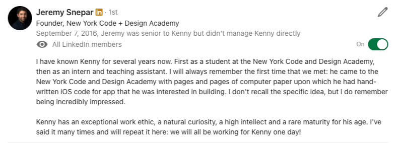
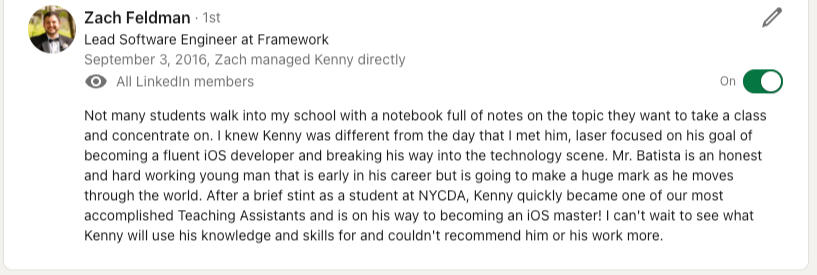
Below you can find recommendations from people/clients i've worked with. You can also find them directly on my LinkedIn profile (scroll all the way down)





The Benk Group, LLC - Privacy Policy & Data Deletion
Last Updated: July 1, 2023Instructions for data deletion:
- email kennybatista7 at gmail.com and request for your data to be deletedThe Benk Group, LLC ("we", "us", or "our") respects your privacy and is committed to protecting it through our compliance with this Privacy Policy.This policy describes:The types of information we may collect from you or that you may provide when you fill in a Facebook Leads Ad form ("Form").
Our practices for collecting, using, maintaining, protecting, and disclosing that information.
By providing your information in the Form, you accept and agree to be bound and abide by this Privacy Policy.1. Information We Collect About You
We collect several types of information from and about users of our Form, specifically:"Personal Information": information by which you may be personally identified, such as name, postal address, e-mail address, telephone number, or any other identifier by which you may be contacted online or offline."Non-personal Information": about your internet connection, the equipment you use to access our Form and usage details.2. How We Collect Information
We collect this information:Directly from you when you provide it to us.
Automatically as you navigate through the site. Information collected automatically may include usage details, IP addresses, and information collected through cookies.
3. How We Use Your Information
We use information that we collect about you or that you provide to us, including any personal information:To provide you with information, products, or services that you request from us.
To fulfill any other purpose for which you provide it.
To carry out our obligations and enforce our rights arising from any contracts entered into between you and us, including for billing and collection.
To notify you about changes to our website or any products or services we offer or provide though it.
To allow you to participate in interactive features on our website.
4. Disclosure of Your Information
We may disclose aggregated information about our users, and information that does not identify any individual, without restriction.We may disclose personal information that we collect or you provide as described in this privacy policy:To our subsidiaries and affiliates.
To contractors, service providers, and other third parties we use to support our business.
To a buyer or other successor in the event of a merger, divestiture, restructuring, reorganization, dissolution, or other sale or transfer of some or all of The Benk Group, LLC's assets, whether as a going concern or as part of bankruptcy, liquidation, or similar proceeding, in which personal information held by The Benk Group, LLC about our Form users is among the assets transferred.
5. Data Security
We have implemented measures designed to secure your personal information from accidental loss and from unauthorized access, use, alteration, and disclosure. All information you provide to us is stored on our secure servers behind firewalls.6. Changes to Our Privacy Policy
It is our policy to post any changes we make to our privacy policy on this page. If we make material changes to how we treat our users' personal information, we will notify you through a notice on the Form home page. The date the privacy policy was last revised is identified at the top of the page.7. Contact Information
To ask questions or comment about this privacy policy and our privacy practices, contact us at: [email protected]By using the Form, you agree to the terms and conditions of this Privacy Policy. If you do not agree to these terms and conditions, please do not use the Form. We reserve the right, at our sole discretion, to change, modify, add or remove portions of this policy at any time.Your continued use of the Form following the posting of changes to this policy will mean that you accept those changes.Thank you for choosing The Benk Group, LLC.
